Notes on:
Endogenous Monetary Policy Effectiveness
ECB Working Paper 3281
15 September 2026
monetary policy transmission · state dependence · debt service ratio · euro area
Paper · PDF
Made with AI: Opus 5 (reading, diagram and writing), GPT 5.6-Sol (reading), Fable 5.1 (adjudication), GPT 6-Astra (verification)
Valerio Scalone (ecb) and Silvana Tenreyro (lse), “Endogenous monetary policy effectiveness,” ecb Working Paper No 3281, September 2026. This digest covers the paper alone. There is no talk recording, no discussant and no Q&A behind it, so the objections below are the digest’s own and not anyone’s in a room. Version used: the September 2026 ecb working paper version, including its online appendix.
Exposure is not the weather
There is by now a comfortable literature saying that monetary policy works harder when borrowers are stretched. You are a household with a variable-rate loan and a debt-service bill that has been climbing, the ecb raises rates, and you cut spending because you have to. You are the same household two years after you refinanced and paid some of it down, the ecb raises rates, and you grumble and carry on. Put a state variable for “stretched” into a smooth-transition local projection and the stretched regime shows the bigger output response. Alpanda, Granziera, and Zubairy (2021) have a version of this. Tenreyro and Thwaites (2016) have one for the business cycle rather than the financial one.
The thing all of these take as given is the state. Exposure is the weather: the central bank looks out of the window, sees debt service rising, and revises its view of how hard its next move will land. Scalone and Tenreyro’s point is that the central bank is also partly making the weather. A hike raises the lending rate on whatever share of private debt reprices. That raises the debt-service ratio, which pushes the economy toward the regime where hikes bite harder. So a tightening cycle sharpens itself as it goes, and a loosening cycle blunts itself. In the paper’s words, “a sequence of tightening or loosening moves does not simply have a constant effect each time: the potency of policy can build up or fade away as the monetary cycle progresses.”
That is the title claim, and it is plausible enough not to surprise you. The interesting parts are how the econometrics produces it, what the figures show as opposed to the prose, and one result about hiking into a boom that goes the other way.
The loop
The exposure measure is the debt-service ratio of the euro-area non-financial private sector, households and firms together, built the Drehmann et al. (2015) way (eq. 6 in the paper):
Here is loans plus debt securities, is nominal gdp summed over four quarters, is the average lending rate to firms and households and is average debt maturity, so the ratio is the annuity payment on the whole private debt stock as a share of income.
Look at what sits in the numerator: the lending rate. The measure of how exposed borrowers are to interest rates contains interest rates. That is not a scandal. Debt service really does rise when rates rise, and that is the channel the authors want. But it means that a good part of “tightening raises exposure” is true by construction, and you should keep that in mind each time the paper reports that it does.
The state is not the level of this ratio but its build-up. The paper takes the two-year change, , and smooths it with a seven-quarter moving average whose weights decline linearly (eq. 7), following the macroprudential early-warning literature. The argument is that a high but stable ratio means borrowers have already adjusted, while a rising one means stress that has not yet been absorbed. So “high exposure” here means the build-up phase of the financial cycle, not high leverage. The smoothed change goes through a logistic with and a threshold at the median of , which gives a regime weight between 0 and 1.
The model is a two-regime smooth-transition local projection. It has seven variables: real gdp, hicp, commodity prices, three-month Euribor, the median euro-area bank’s expected default frequency (edf), real house prices and the dsr itself. At each horizon they are projected on their current values, with separate coefficients in a high-exposure regime U and a low-exposure regime D, blended by . The data are quarterly euro-area series from 2001Q1 to 2019Q4. Policy shocks are identified recursively: the rate reacts within the quarter to output and prices but not to the financial variables. Every exercise in the paper chains together the impulse response in eq. 4 in the paper:
Here is the Cholesky impact matrix, shared by both regimes, is the vector of structural shocks, and are the horizon- projection coefficients in each regime, and is held at its value on the date of impact.
Look at that for a second, because it says something the abstract does not. Given , the response is linear in the shock. A hike and a cut of the same size produce mirror-image responses, and a shock twice as large produces a response twice as large. Within a single shock there is no sign asymmetry and no size asymmetry at all. Every asymmetry in the paper, including tightenings beating loosenings and steep cycles differing from gentle ones, comes from one place: the update of between shocks. Because the dsr is one of the endogenous variables, each shock comes with an lp-predicted path for . The simulation adds up those predicted paths from all earlier shocks, recomputes and , and uses the new for the next shock’s response, frozen over that shock’s twelve-quarter window. Eq. 5 then sums the responses over the cycle. A “tightening cycle” is therefore a sequence of unanticipated hikes, each landing in a slightly more exposed economy than the one before. (One loose end: the text says the state depends only on past values, but eq. 7’s sum starts at , the current quarter.)
When exposure was high
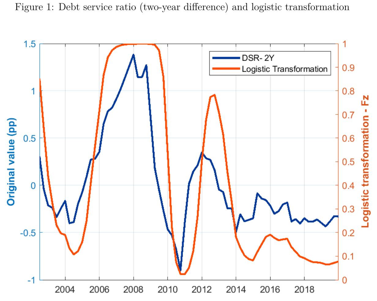
The red line is . In the figure it sits near 1 from 2006 to 2009, falls almost to zero in late 2010, climbs back to about 0.8 in 2012–13 and then stays below 0.2 almost continuously from 2014 to 2019. The text tells a different story. It says exceeds 0.8 in 26 quarters, concentrated in 2004Q2–2008Q3 and 2010Q3–2011Q4, and falls below 0.2 in only three quarters, which the authors put down to slow deleveraging after 2012. Both cannot be true. In the figure, 2004–05 is low exposure, and 2010Q3–2011Q4 contains the sample’s trough. Also, with at the median, should be above 0.5 half the time, but the plotted line is above 0.5 for roughly 20 of about 70 quarters. Which version matches the code is unknowable from the paper, and it matters. If the text is right, the responses below mostly extrapolate the logistic beyond anything observed. If the figure is right, the low regime is well populated, but mostly by the negative-rate years of 2014–19. Either way, the high regime is mostly the financial crisis, its run-up and the sovereign crisis.
One shock, three states
The first exercise compares a one-standard-deviation policy shock, worth about 20 bp on Euribor on impact, at = 1, 0.5 and 0. Without conditioning, the result is less dramatic than the abstract suggests. At , output and inflation look like the linear model. At they are “close to insignificant.” But the policy rate itself behaves differently across states, which muddies the comparison. So the authors add compensating policy shocks each quarter to make the rate path identical across the three states for the first year, and then let it go. Under that conditioning, output and the price level fall about 1.3% at peak under maximum exposure. The text calls the output fall “more than four times” the one under minimum exposure. The figure does not quite show that. The output line reaches its own trough of about −0.45% around six or seven quarters, so peak to peak the ratio is 2.5 to 3. “Four times” holds only if you read the low-exposure line at the high-exposure line’s peak nine quarters out, by which point it has mostly recovered. For inflation, “more than double” is fair. Two and a half to three is still large; it is just not the number in the text.
Then there is significance. The one formal test of the gap is Fig. 3, which plots the high-minus-low difference with 67% bands, computing the difference within each bootstrap draw. The output gap excludes zero from about horizon 2 or 3 through 6, and the inflation gap from about 2 through 8. The plotted differences, though, are around −0.5 at horizons 4–5 and −0.2 at horizon 9. Those match the unconditioned responses, not the conditioned ones behind the −1.3% headline, and the note does not say which set it uses. So the difference test covers the small gap, and the big gap has no difference test at all. The text also says the edf difference is significant “over the full projection horizon,” but its band crosses back over zero at several horizons. The 90% material in the appendix shows a separate band around each response, not a band for the difference, and those bands overlap heavily. The claim that the responses “remain distinguishable at the 90% level” is asserted, not shown. Throughout this paper, “significant” means a 67% band excluding zero.
The paper tests its own calibration choices in Table F.1, the most candid exhibit in it.
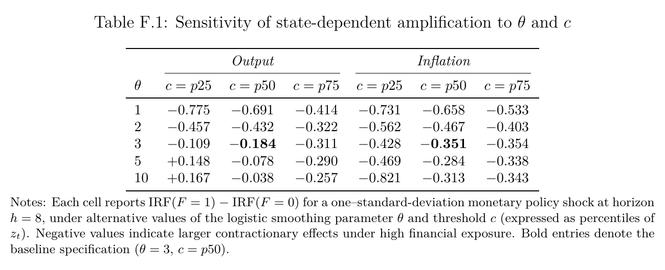
The table reports irf(=1) minus irf(=0) at horizon 8 across five values of and three thresholds. The inflation gap is negative in all fifteen cells. The output gap is negative in thirteen. The two exceptions, +0.148 and +0.167, sit at the 25th-percentile threshold with of 5 or 10, where more than 80% of the sample falls in the high regime. The median-threshold column is more telling. As goes from 1 to 2, 3, 5 and 10, the output gap runs −0.691, −0.432, −0.184, −0.078, −0.038. The baseline −0.184 sits in the middle. The sign holds, but the sharper the regime switch, the more the gap melts away. A twentyfold range across reasonable calibrations is a lot for a paper whose contribution is a quantitative claim about how much more potent the next hike is.
With the Jarociński–Karadi (2020) high-frequency ecb shock in place of the Cholesky one, output still contracts more under high exposure, but inflation’s ordering flips around seven quarters out. There is no difference test and no first-stage statistic.
Cycles
Now for the part the title is about. Start at , raise or cut the policy rate by 1 pp over four quarters using nothing but policy shocks, and watch . After two quarters it is 0.58 in the tightening and 0.43 in the loosening. After four it is 0.75 and 0.25. Hit each economy with one more standard shock at that point, and the text says output and prices respond about 22 bp more at peak after the tightening than after the loosening. In the figure, measured against the median-state response, the output gap is about −0.13 around horizon four after the tightening and +0.14 after the loosening.
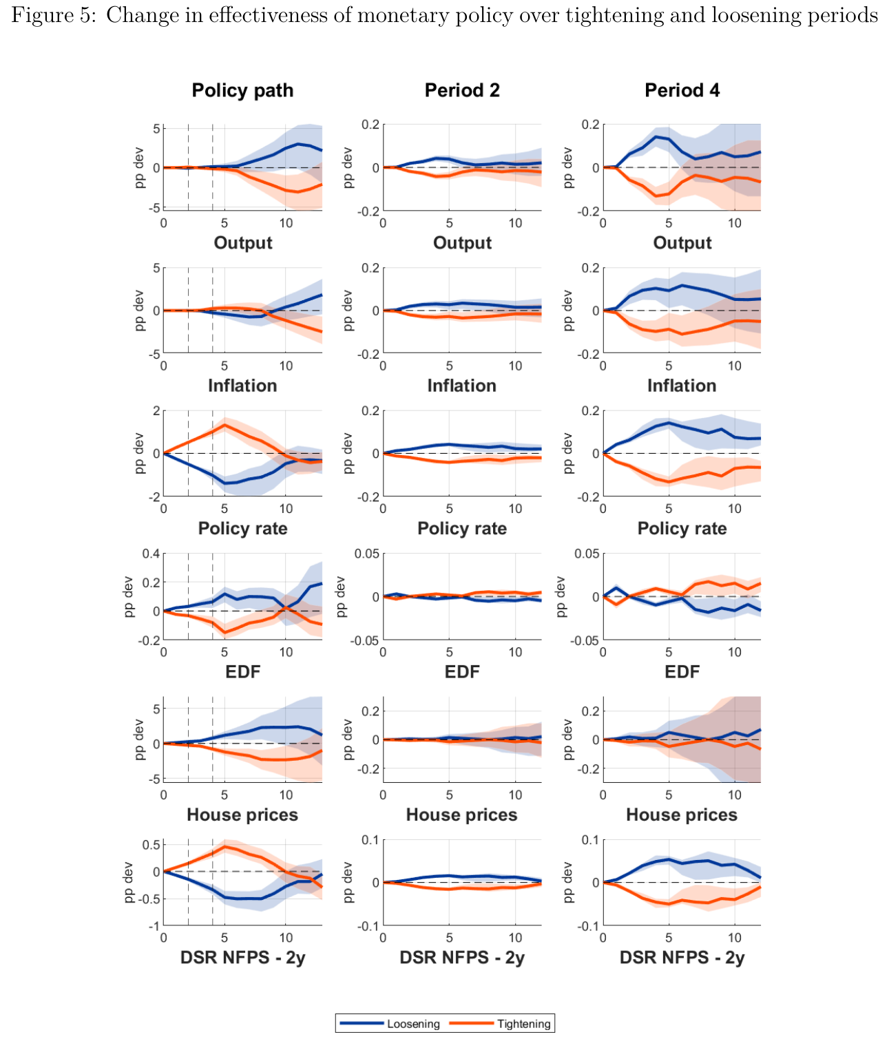
A steeper cycle, 4 pp over the same four quarters, takes to 0.98 or 0.01, and the next shock’s effect diverges “visibly” further. No point estimates are given.
Two items in the ledger deserve attention. First, the cycles’ output totals are −3.1% for the tightening and +3.0% for the loosening, which is essentially symmetric. The asymmetry the text claims, that “the tightening has stronger effects than loosening in absolute terms,” shows up in prices (−2.5% against +1.9%) and in the next-shock comparisons, not in output. Second, the median bank’s expected default frequency falls by about 0.15 pp while the tightening cycle runs, even though a single contractionary shock raises it. The authors point to bank margins widening when rates rise.
Then there is what the cycle is made of. A one-standard-deviation shock moves Euribor about 20 bp on impact and then decays. Getting to 1 pp over four quarters therefore takes several standard deviations of surprise per quarter, and the 4 pp path takes several times that. The paper does not report the shock sizes. Every basis point of the cycle is a deviation from the estimated reaction function, which is not how real hiking cycles work: they are mostly systematic, signalled and priced. Suppose you want to take “late hikes bite harder” to a policy committee. You have to believe that the response to a surprise arriving after a run of surprises tells you how the tenth expected hike will propagate. That is the Lucas (1976) critique, dressed as a local projection.
The same logic is applied to housing and demand shocks, both labelled by their place in the ordering: they do more damage after a year of tightening () than after a year of loosening ().
Hiking into a boom
This is the surprising result. Run the same 1 pp tightening over a year against three backdrops. In the neutral one, only policy shocks move the rate. In a recession, output is made to fall 2% in the first year, using a mix of output and policy shocks. In an expansion, output rises 2%.
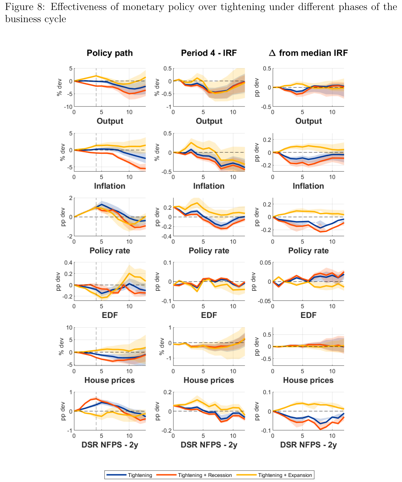
In the recession, the dsr rises 64 bp, goes from 0.5 to 0.88 and output is 5% lower by the end of year two. The next policy shock’s peak output effect is 0.18 pp stronger than at the median state, against 0.10 in the neutral case. In the expansion, the dsr falls slightly and ends the tightening at 0.30. A full point of hikes leaves the economy less exposed than it started.
The authors explain this with the denominator of eq. 6, nominal gdp. In the expansion, income growth more than offsets the higher lending rate. In the recession, the numerator rises while the denominator shrinks. Two cautions apply. First, the simulated dsr path is not eq. 6 recomputed from predicted debt, rates and income. It is the lp-estimated dsr response to that mix of output and policy shocks, so the offset is an empirical outcome of this specification, and the accounting is an interpretation laid over it. Second, this is one experiment, with output up 2%. Nothing in eq. 6 says debt service cannot outrun growing income, and the paper does not show where the threshold lies. The fair statement is this: the more you hike, the harder the next hike bites, unless income grows fast enough to carry the extra debt service. How potent the next move is depends on why rates are rising.
The paper’s own summary of this result has two problems. The abstract says effectiveness in an expansion “is not materially affected,” and the text says it “remains stable.” But the third column of Fig. 8 shows a positive expansion gap, about +0.08 to +0.10 for output around four quarters out. That means the next hike is somewhat weaker, as you would expect with . Separately, the text gives the neutral-case price-level gap as −0.17 pp, but it plots at about −0.10 to −0.12. The recession figure, −0.23 against roughly −0.20 on the plot, is close enough.
The authorship makes this more interesting. Tenreyro and Thwaites (2016), “Pushing on a string,” found us monetary policy less powerful in recessions. Here, tightening in a downturn is more powerful. The paper cites the 2016 result as a precedent for state dependence and leaves the tension alone. A reconciliation is available. The state here is the build-up of debt service, not the business cycle, and a recession with rising rates is a state of fast-growing debt service, which is not what most recessions look like. The authors also map the two scenarios onto supply-driven and demand-driven inflation. Since the recession is built from negative demand shocks rather than supply shocks, that analogy is loose.
What the paper does about the obvious objections
The appendix reads like a response to a referee. Appendix A uses the dsr level instead of its change. The text calls the results “qualitatively similar… with the exception of edf and house prices.” What actually survives is the rate-path-conditioned output and inflation gap. In the unconditioned panel the output ordering reverses: low-exposure output falls about 0.9% late in the horizon while high-exposure output stays near zero. Appendices B to D swap in edf dispersion and the term spread as the financial variables. Appendix E extends the sample to 2023Q4 with a Covid dummy and a ridge penalty, but only for the single-shock exercise. There the conditioned gap holds, but house prices rise late in every state. Alternative orderings, alternative commodity indices, a bootstrap-after-bootstrap correction and updating within each shock (“quantitatively very close”) are all asserted without exhibits. Wherever the paper says “robust,” read it as “the conditioned output and inflation gap survives.”
What a sceptic would press: the high regime is the financial crisis and the sovereign crisis. If the figure is right, the low regime is mostly the negative-rate years, when the short rate was pinned and a quarterly Cholesky shock to Euribor is plausibly measured badly. That last point is a hypothesis, since the paper offers no sub-period evidence either way. There is no horse race against a business-cycle or credit-growth state, and no sample that drops 2008–09. The euro-area dsr pools households, firms and countries with very different mixes of fixed-rate and variable-rate debt, and the paper says only that “a fraction of outstanding loans automatically tracks the short-term rate.” The notes also do not say whether the cycle bands carry the uncertainty from the state update and the shock recalibration.
None of this makes the mechanism wrong. It makes the numbers softer than the prose. The baseline sample ends in 2019Q4, a little over two years before the ecb began the fastest tightening in its history, which is the obvious test case. That episode enters only in the appendix’s single-shock check. By the paper’s own logic, whether those hikes sharpened or blunted the next ones depends on whether nominal income outran the lending rate. In 2022, nominal income was being pushed up by exactly the thing the hikes were aimed at.