Notes on:
Accounting for Cross-Country Income Differences Revisited
NBER Working Paper 35826
1 September 2026
development accounting · human capital · TFP · growth
Talk · Paper · doi · PDF · Transcript
Made with AI: Opus 5.5 (reading and writing), GPT 6-Sol (reading), Fable 5.1 (adjudication), GPT 6-Astra (verification)
David Lagakos and Todd Schoellman · Talk source: Todd Schoellman, “Human capital in developing countries”, steg Virtual Course supplemental lecture, February 2021 (video) · No discussant · pdf version used: nber Working Paper 35826, September 2026
Development accounting is the part of growth economics whose headline result is a confession. You take a country’s gdp per worker, you measure what went into it (machines, workers, the stuff in the workers’ heads), you push those inputs through a common production function, and whatever you can’t match you call tfp. Then you ask how much of the cross-country spread lines up with the inputs and how much is left over. Twenty years ago Francesco Caselli ran the exercise carefully and summarised the answer, in a line Lagakos and Schoellman quote with evident affection, as “no, way no.” Inputs covered about a third of the gap. The rest was the residual, which the September 2026 nber draft calls, in the traditional way, “the measure of our ignorance.”
The draft is a survey, and a survey’s job is to tell you what the literature has learned since the last one. Its answer is that we are less ignorant than we thought, and that nearly all of the improvement is about people. On the same data and the same metric, the classic setup gives inputs 30 percent; the authors’ “plausible range” after two decades of new measurement is 50 to 65 percent. Hours go the wrong way, physical capital stays small, and human capital does the lifting.
A word about the talk. There isn’t one for this paper. What exists is a lecture Schoellman gave to the steg virtual course in February 2021 on the human-capital half of the story, five years before this draft. It is a precursor, not a presentation of the paper, and it is useful precisely because its numbers are not the draft’s numbers: you can watch the human-capital estimate move between 2021 and 2026, and you can see which questions the room was already asking.
The machine, and the knob that matters
The production function is Cobb-Douglas, with and , and human capital in the classic version is : ten percent per year of schooling, on the strength of Mincer regressions whose return doesn’t vary much with development. None of that is new. The choice that does the work is how you write output per worker. You can write it in capital per worker, or you can write it like this:
Here is gdp per worker, the capital-output ratio, human capital per worker, tfp, and capital’s output elasticity; equation (6) is the one the authors use throughout.
The reason is a piece of long-run logic that sounds like a technicality and isn’t. If tfp rises in a country, the marginal product of capital rises, and people build capital until it falls back. In most models the marginal product of capital is pinned down in the long run, by a world interest rate or a common discount rate in an Euler equation, and holding the marginal product fixed is the same as holding fixed. So the capital that a high-tfp country accumulates because it has high tfp gets credited to tfp, not to capital. Under equation (6), capital looks small and and look bigger. Under the capital-per-worker form, the same machines look large, because the form hands capital the credit for capital that tfp induced. (Whether human capital responds to tfp in the same way is the open question the authors flag early and never settle. Becker’s benchmark says no, since if schooling costs only time, a higher tfp raises the payoff and the opportunity cost equally; add goods inputs or imperfect substitution and you can get a yes.)
Then you need a way to score each factor. The authors use the covariance share:
where is one of the multiplicative factors in (6) and is gdp per worker; equation (7) is just the slope from regressing on , so the shares add up to one across factors.
Two properties make it the right tool for a survey. It’s additive and order-invariant, so a paper that measures one input can be dropped into the tally without re-running everyone else’s. And a factor that goes the wrong way gets a negative number, which is going to matter in about three paragraphs. The one catch, which the authors state in a footnote, is that exact additivity holds only on a common sample of countries, and the samples below do not all match.
The authors keep returning to an analogy from mortality: decomposing life-expectancy gaps by cause of death won’t tell you why children in poor countries die of malaria and diarrhoea, but it will tell you not to spend your research budget on statins for older adults. Development accounting is the same kind of object. It says where the gap is, not what caused it. Everything below “accounts for”; nothing “explains.”
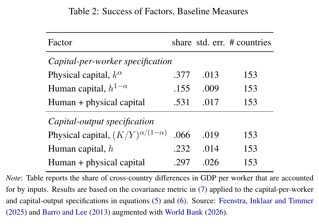
On Penn World Table 11.0, with 2023 data for 153 countries covering 96 percent of the world’s population, the classic setup gives inputs 53 percent under the capital-per-worker form and 29.7 percent under the capital-output form (Table 2). That is the knob. Turning it moves physical capital from 37.7 percent to 6.6 percent and nudges years of schooling up from 15.5 to 23.2, so the total nearly halves.
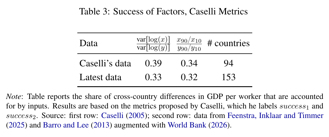
Caselli’s own metrics give 0.39 and 0.34 on his 94 countries and 0.33 and 0.32 on today’s 153 (Table 3). The authors are candid that their 30 matching his 33 is “a bit of a coincidence”: the capital-output form shrinks the role of inputs, the covariance metric enlarges it, and the two cancel. The nice part, from the point of view of anyone who wants to compare numbers across twenty years, is that the coincidence holds throughout the paper. So the baseline is settled: on modern data, done the old way, inputs cover about 30 percent. Now the authors go input by input and ask what the last two decades changed.
Hours: the input that makes it worse
You might expect poor countries to be poor partly because fewer people work, or they work less. New labour-force surveys (Bick, Fuchs-Schündeln and Lagakos, covering 80 countries, and Gethin and Saez, covering 160) say otherwise. Employment per person is lower in poor countries, around 0.4 in the bottom income quartile against 0.6 in the top, but that is entirely children. Adults in the poorest countries are more likely to work, less likely to be unemployed, and work more hours.
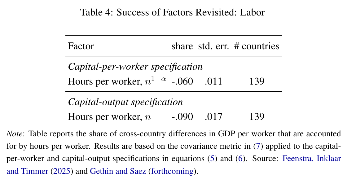
So hours per worker account for −9 percent under the preferred specification (Table 4). This is where the covariance metric earns its keep: rather than quietly vanishing, hours show up with a minus sign, and the authors’ phrasing is the right one: it “only worsens the development puzzle.” Poor-country workers are putting in more time and producing less, so the productivity gap per hour is bigger than the gap per worker. (There are big differences in hours per adult among countries at similar incomes, such as Ecuador working twice as much as Iraq, but those trace to female participation, tax-and-transfer systems and conflict, not to development.)
Physical capital: still small, unless you ask about the government
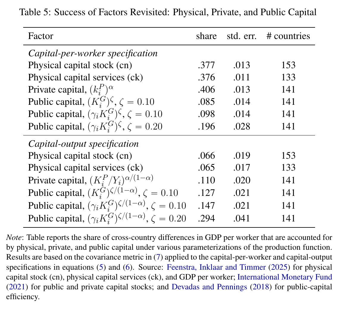
Caselli’s physical capital was a stock: cumulated, depreciated investment. The newer approach measures capital services, the flow of productive use, which ought to differ if poor countries hold different kinds of capital with different rental rates. It turns out they do, and the effects offset. Poor countries face higher required returns, which raise the service flow, but hold longer-lived capital with lower depreciation, which lowers it. Net effect: 6.5 percent against 6.6.
Natural capital, if anything, goes the other way. Resource rents as a share of gdp are uncorrelated with income, so netting them out of gdp makes poor countries look more dispersed (the 90-10 ratio goes from 16.0 to 17.7) and takes inputs from 30 to 26 percent.
The interesting line is public capital. Pritchett’s old point was that “cumulated, depreciated investment expenditures” measure what governments spent, not what they built. The authors split capital into private and public, give public capital its own output elasticity and an efficiency term from Devadas and Pennings, and get the rows at the bottom of Table 5: private capital 11 percent, public capital 12.7 percent at , 14.7 percent once you allow for the fact that roughly half of public investment in the least productive countries generates no capital, and 29.4 percent at . At , the text says, “capital as a whole accounts for 40–60 percent.”
Two things are worth noticing. First, adding the efficiency correction barely moves the number, and the reason is almost funny: rich countries’ public capital stocks are about two orders of magnitude larger than poor ones’, so halving what the poor countries have is a rounding error on the log scale. Second, the whole row hangs on , and the estimates of are mostly from before the credibility revolution, with only 7 percent from low- or middle-income countries, which the authors describe, with a phrase borrowed from the literature, as “the area under the lamppost.” Their verdict on public capital is Caselli’s verdict, repeated two decades later: “potentially quite important.” That is honest and also a little bleak. It’s why public capital sits outside the headline.
Human capital, built from parts
This is where the revision happens. The classic is years of schooling. The constructive approach adds everything else you can measure and price.
Schooling quality comes in two ways that agree with each other. Harmonised test scores for 164 countries, valued at 20 percent of wages per standard deviation, show many developing countries more than two standard deviations below the oecd mean. Separately, immigrants to the us earn at least 10 percent per year of schooling acquired in rich origin countries and under 5 percent for schooling acquired in poor ones. Life-cycle experience matters as much: wages roughly double over a working life in the richest countries and rise about 50 percent in the poorest. Because returns to experience look similar for migrants and non-migrants from the same country, the authors read this as portable human capital rather than search frictions or long-term contracts. They offer that as the interpretation the evidence “points toward,” with bounds, not a proof. Health enters through adult height at age 19, at Weil’s 3.4 percent per centimetre, with gaps of up to 15 centimetres. Put together, the draft’s measured human capital varies nearly sixteenfold across countries.
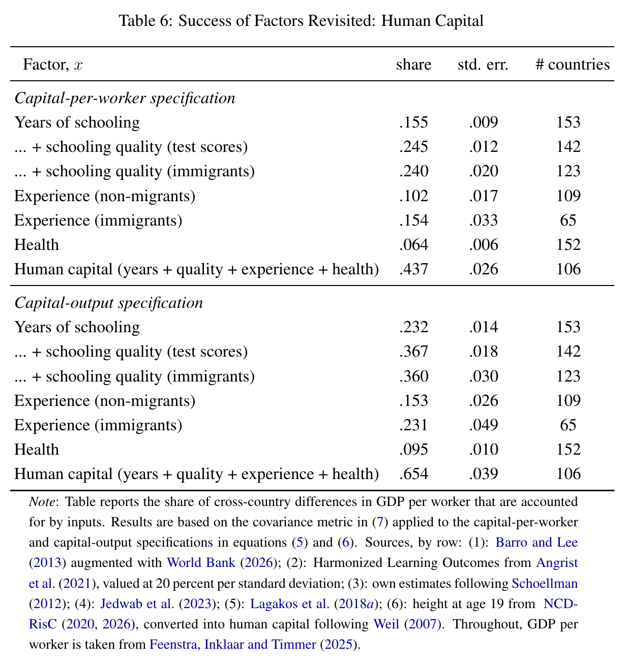
Under the capital-output specification, years alone account for 23.2 percent, years plus quality about 36 to 37, experience 15 to 23 depending on the source, health 9.5, and the full bundle 65.4 percent (Table 6). If you add up the rows and get 61.5 rather than 65.4, you haven’t made an error: the rows use different country samples (142, 109, 152) and the total is computed on the 106 countries that have everything. The additivity footnote is now doing some work.
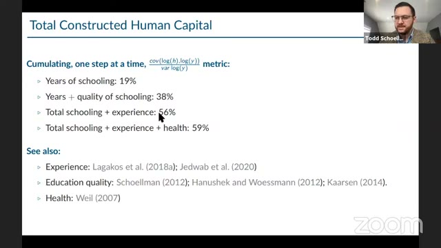
Here is the 2021 lecture’s version of the same tally: years 19, plus quality 38, plus experience 56, plus health 59. The architecture is identical and the pieces have shifted. Years went from 19 to 23 (Penn World Table 10.0 then, 11.0 now). The quality proxy changed from pisa 2018 maths to harmonised learning outcomes. And health changed the most. In 2021 it was adult survival, the probability that a 15-year-old reaches 60, and it added about three points, which Schoellman plainly found unsatisfying: “I just always feel like it’s important but … I’ve never proved it” (00:46:28). In 2026, with height as the proxy, health alone accounts for 9.5 percent. That is a standalone share on 152 countries, not an increment on top of everything else, so it isn’t a like-for-like comparison. But the direction matches his hunch. The draft adds that the authors are “aware of no subsequent work” revisiting health’s role in development accounting since Weil, while crediting recent progress on measuring aggregate health stocks elsewhere. So the gap is in this literature, not in health economics.
What the draft deliberately leaves out is early childhood, parenting and culture. The evidence there is suggestive (Indochinese refugees show roughly no age-at-arrival effect; gaps in child test scores are already there at age five; Ek finds about a threefold productivity gap among migrants in Sweden, predicted by their origin countries’ cultural autonomy). But every one of these probably runs through schooling, experience and health, so adding them would count the same human capital twice. Schoellman made the same double-counting point against his own approach in 2021 (00:46:57): the constructive method can’t be exhaustive and can’t be sure its pieces don’t overlap. That is the motivation for the other method.
Human capital, backed out from migrants
Here is the cleverer idea. A migrant carries across the border and leaves and behind. So if you follow the same person from, say, a country at one-twentieth of us gdp per worker into the United States, the change in their wage is the country effect: capital-output and tfp, with human capital held fixed by construction. Whatever part of the gdp gap the wage jump doesn’t cover must be human capital. You never have to list what human capital is. You just deduce its size from what’s missing.
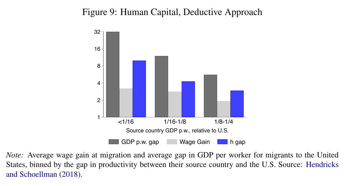
Using Hendricks and Schoellman (2018), migrants from countries below 1/16 of us gdp per worker raise their wages 3.2-fold against a gdp gap of 31.8. So moving closes percent of the gap, and the other 66 percent is human capital. The next two bins give 58 and 63. The range, 58 to 66 percent, sits right on top of the constructive approach’s 65. The authors call it “a strikingly similar number,” and this is the thing in the paper worth remembering: one method adds up schooling, test scores, wage profiles and height; the other ignores all of that and watches a paycheck change at an airport, and they land in the same place. Because it’s the same person before and after, the deductive method also handles selection on ability, which is strongly positive and correlated with development. A Glassdoor study of 76,000 skilled migrants who moved in both directions finds asymmetries consistent with comparative-advantage selection or skill-transfer frictions, but adjusting for them has a small effect.
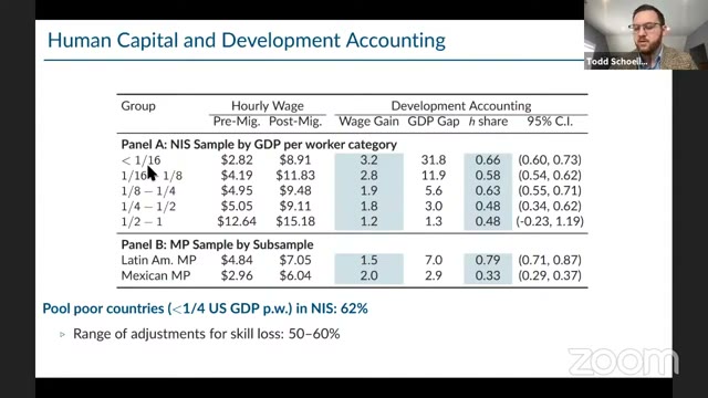
The 2021 slide shows the same table with more rows than the draft’s Figure 9. It includes the richer bins, where the human-capital share falls to 0.48, and two other migrant samples that disagree with each other (0.79 for Latin American migrants, 0.33 for Mexican). It also shows a hedge the draft dropped: pooled poor countries give 62 percent, and “50–60%” after adjusting for skill loss at migration. In 2021 Schoellman’s summary was that human capital “accounts for half to maybe 60 percent” (01:03:59), with the same line about convergence: “although it comes from a completely different direction you end up getting fairly similar results” (01:03:44). By 2026 the range is 58 to 66 and the skill-loss discount is gone, replaced by the two-way-movers evidence that the adjustment is small. The range moved up a few points and lost its skill-loss discount.
It is worth being precise about how independent the two approaches are. They share almost no data. They do share the model: the draft states that the deductive approach rests on the same Cobb-Douglas function and the same two macro-Mincer assumptions, perfect substitution across skill levels and competitive labour markets, as the constructive one. Their agreement is strong evidence that the measurement is right given the framework. It isn’t evidence that the framework is right, and the next section is the authors showing what happens when you loosen it.
When skilled and unskilled workers aren’t the same thing
Replace the perfect-substitutes assumption with a Katz-Murphy ces aggregator of skilled and unskilled labour. The puzzle it exposes is simple: rich countries have far more skilled workers but not lower skill premia. With a downward-sloping demand curve, that is only possible if skilled labour is much more efficient in rich countries, more than sixteen times more at . Some of that is better skilled workers (Jones) and some is technology biased toward skill (Caselli and Coleman). Evidence from immigrant returns and from trade says skill bias accounts for 67 to 91 percent of the variation.
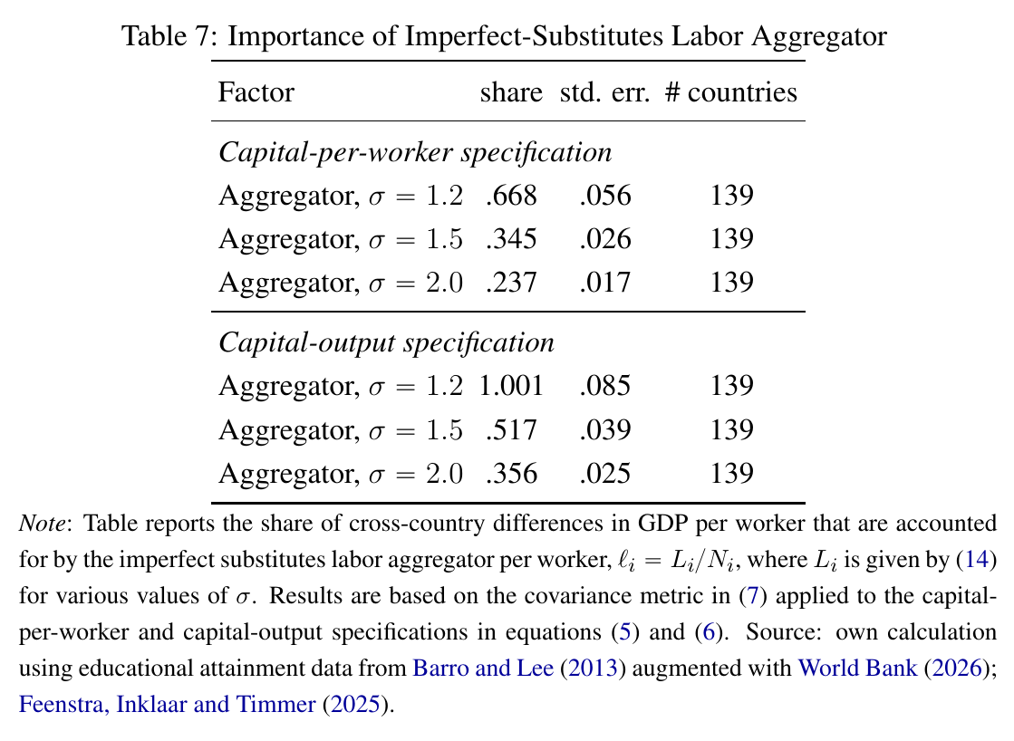
The accounting result depends almost entirely on (Table 7). With perfect substitutes the labour aggregator accounts for 19 percent; at , 35.6; at , 51.7; at , 100.1 percent, meaning labour alone covers the whole gap and then some. The authors say that with physical capital and the other human-capital pieces “we might account for 83 percent.” They don’t itemise it; adding 51.7 for the aggregator, 6.6 for physical capital, 15.3 for experience and 9.5 for health gives 83.1, which looks like the calculation, though that is a reconstruction. They’re also clear about what the aggregator is. It isn’t labour. It bundles the skill share, the quality of skilled workers and the skill bias of technology into one term, and once you use it the decomposition stops being additive and order-invariant. The substantive lesson is that those three things move together across countries, which points to something that determines them jointly rather than three separate inputs. Long-run estimates of run 4 to 5, and on the pattern in Table 7 a higher means a smaller aggregator share, heading back toward the perfect-substitutes 19 percent. The authors keep this item outside the headline, correctly.
Adding it up, roughly
The headline is that inputs “probably account for” 50 to 65 percent, against 30 for the classic setup. The draft says it reached this by combining the tables, and names three pieces: hours −9, broader human capital 58 to 66, physical capital 7. Add those and you get 56 to 64. That’s inside 50–65, but the 50 isn’t derivable from the pieces as printed, so read the range as the authors’ judgement of what’s plausible, not a sum. The authors call it a “plausible range” themselves. Public capital and the ces aggregator, the two items that could push the number much higher, are explicitly outside it, labelled as the places where “the plausible range of results remains wide.” Nearly all of the revision from 30 to the 50s and 60s is human capital. Hours subtract and machines barely add, so the story is a reassessment of what workers carry, not a discovery of more work or more capital.
What remains is still tfp, and the survey’s last section pokes at that too. Management practices account for about a third of tfp variation across 34 countries. Managers and professionals are paid 9.7 times gdp per worker in the poorest decile and 0.8 times in the richest, which is what scarcity looks like in a price. Firm-embedded productivity, measured from multinationals’ market shares or fdi, accounts for 28 or 34 percent on the same metric. Agriculture looks less uniquely unproductive once non-agricultural ppps are rebuilt, and its production function isn’t Cobb-Douglas anyway. None of this is added to the headline. It is the list of places the residual might be hiding.
What the 2021 room pushed on
There was no discussant; the lecture was a teaching session with panellists who could interrupt and a webinar question box. The pushback is worth reading next to the 2026 draft, because several of the questions are ones the framework still can’t answer.
Early on, a panellist noted that the setup rules out human-capital externalities, where aggregate raises . Schoellman agreed and explained why the method can’t see them: externalities are unpriced by definition, and the whole method infers from wages. Another asked whether a Mincer regression that fits badly can measure at all. He put a number on it, an of typically 20 to 30 percent, and conceded the point: either wages reflect things other than (luck, employer, discrimination) or is badly measured, which is “a bit worrying … I agree completely” (00:23:22).
The sharpest line of questioning was whether poor countries can use skills without the matching technology. His answer was that the Cobb-Douglas form rules out any interaction between and technology by construction: “it’s embedded in the production function right from the very beginning” (00:42:32). Asked how to raise education quality, he was blunt: “the uncomfortable and sad truth about this literature is that no one knows,” and “my papers are completely useless on that part” (00:51:51). The 2026 draft’s ces section is where an -by-technology interaction lives in the accounting. That literature predates the lecture, and the draft doesn’t present it as a reply, but the kinship is plain.
On causality (don’t rich countries buy more schooling because they’re rich?), he said the concern has been “an obsession in this literature” from the start (00:55:34), that the right verb is “accounts for” and not “causes,” and that tfp could well drive schooling. That is the open question the draft still leaves open.
In the formal Q&A, one questioner asked about the demand side: do firms in poor countries want skills? Schoellman pointed to skill-biased technical change models and to returns to schooling that are much higher in business services than in agriculture, so structural change likely raises skill demand, though he said no one has fully modelled it. A participant (the captions are unreliable on names) asked about degrees versus years; he said degrees matter but macro-development work maps them to years and runs a linear Mincer, and “that’s just ignored” (01:27:51). A webinar question proposed that firms avoid skill-complementary technology because human capital can’t serve as collateral. “My hunch is yes,” he said, sketching a two-type ces model with endogenous skill bias and a borrowing constraint, and added of his own framework that “this model would not even let you begin to have that conversation” (01:32:19). After the formal close, a question about German apprenticeships got the best aside of the session. Germany is “a really weird country when you do these calculations” (01:36:21): low measured schooling and the steepest experience profiles in the world, with no theory to connect them. On the policy side: “there is so little research … I don’t even know where to start” (01:37:46).
What it can’t tell you
The draft closes with three limitations and they are real. First, development accounting needs outside evidence on both the size of an input gap and how much that input matters in production. When either is missing, as with public capital (no credible for poor countries) or intangibles (no cross-country spending data), the method has nothing to say. Second, the results are proximate. Even if you accept that human capital varies sixteenfold, the method can’t tell you whether that comes from culture, parenting, schools or work. Third, and following from that, there are no policy levers here. Schoellman said as much to the 2021 room more than once, and the draft says it in print. Behind all three is the question from the first section: whether , like capital, responds to tfp. If it does, some of the newly found human capital is tfp’s doing, the same way the capital-output form reassigns induced capital to tfp.
So the revision is this. The residual is smaller than Caselli found, the difference is almost entirely human capital, and two methods with different data put that share around two-thirds. The authors’ recommendation is a “shift back toward research on variation in inputs.” Twenty years ago the field concluded that inputs didn’t matter much and turned to tfp. The draft suggests a good part of what went into the residual was human capital that the inputs side hadn’t yet measured.