Notes on:
Population Aging and the Realignment of World Trade
Working paper
18 September 2026
international trade · population aging · comparative advantage
Talk · Paper · PDF · Transcript
Made with AI: Haiku 4.5 (research), Opus 5 (reading, figures, diagram and writing), GPT 5.6-Sol (reading), Fable 5.1 (adjudication), Sonnet 5 (verification)
Part of Macroeconomic Effects of Population Aging, Fall 2026
Joseph Kopecky’s paper on aging and trade has two results, and they are not the same size. The first is that a country with fewer workers exports less, which is large and true and not very surprising. The second is that a country whose workers get older exports different things, which is small in total and much more interesting. The paper has worked out which one is which and says so. In the talk Kopecky went a step further and conceded, when asked, that the big result is close to an accounting identity. That leaves the small result carrying the paper, so it is worth checking what it can bear.
A note on versions. The public paper is Kopecky’s draft of 25 July 2026. An April 2026 predecessor circulated as tep Working Paper 0726 under the title “The Comparative Advantage of Age,” which is a fair summary of what the paper is really about. He presented the July version at the nber virtual workshop on the macroeconomic effects of population aging on 18 September 2026. A few numbers appear only on his slides, and I flag those as they come up.
The corridor that got a tailwind
Start with China and the United States. Take the 2014 world economy and hold everything fixed: trade costs, technology, capital, participation, expenditure shares. Then change only the age structures, backward and forward. The demographic component of China’s exports to the us rises about 70% between 1980 and 2014 as China’s working-age boom arrives (p. 12; the slide rounds it to 72%). Actual trade grew “many times over” in the paper’s words (p. 12), or “tenfold” on the slide, because globalisation and China’s own industrialisation are exactly what the counterfactual holds fixed. Then the tailwind crests and turns. By 2050, demographics alone leave the corridor 9% below its 2014 level (p. 12). The slide adds 18% below by 2060, a number the paper doesn’t report. Over the same window, India’s exports to the us rise 33% (p. 2).
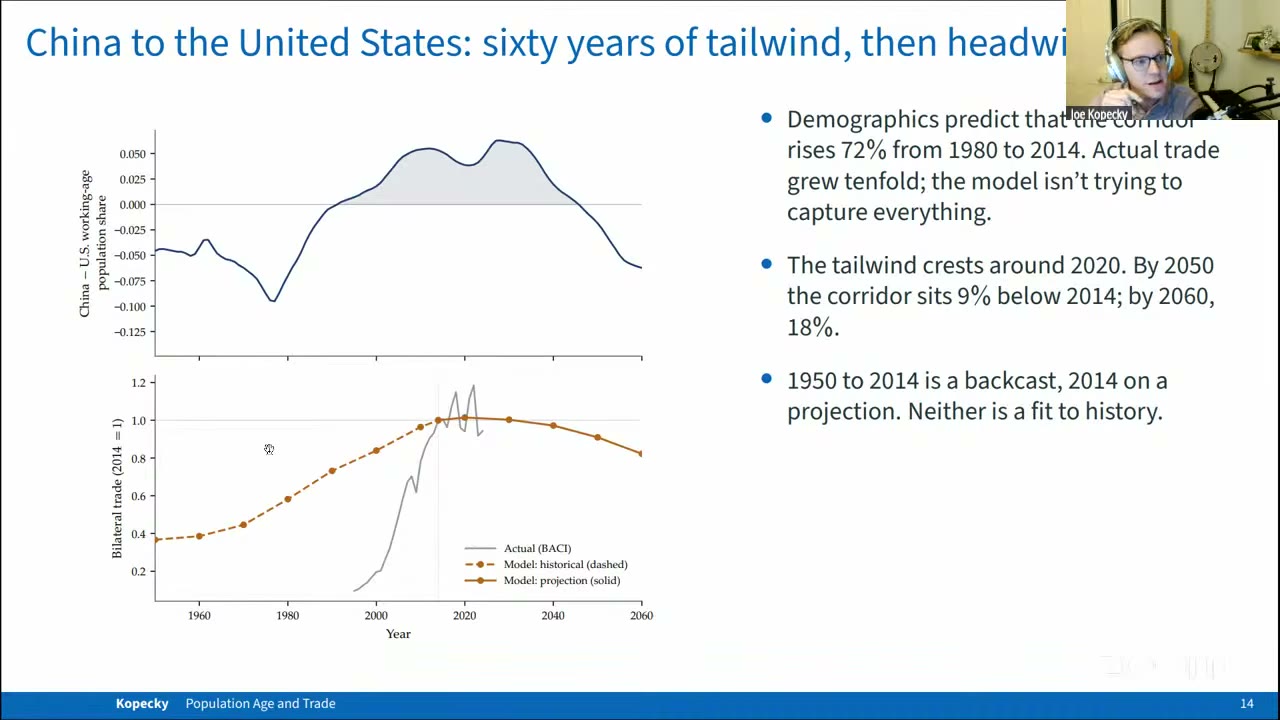
He is clear about what this exercise is. The model is not trying to explain the China shock. It is trying to find the part of the China shock that was just demography, and then run that part forward. In the talk he called the headline result “a very kind of sophisticated accounting exercise” (03:18:06), which is modest and also correct.
The model: Caliendo–Parro with workers who age
The machinery is off the shelf. It is the multi-sector Eaton–Kortum (2002) model of Caliendo and Parro (2015), with 30 economies (29 countries plus a rest of world), 20 tradeable manufacturing sectors, one non-tradeable services sector, input–output links calibrated to wiod (Timmer et al. 2015) for 2014, and counterfactuals solved by exact hat algebra (pp. 3, 10). There is one change. Homogeneous labour is replaced by three task inputs that age differently. The first is age-appreciating cognitive skill (communication and comprehension), which holds up or improves into the mid-50s. The second is age-depreciating cognitive skill (memory, processing speed), which declines from the late 20s. The third is physical skill (p. 4). The data barely tell D and P apart, so the baseline gives them a common profile. That makes it effectively a two-input model that keeps three labels, as Kopecky admitted in the talk (03:10:14).
Demography enters in exactly one place (eqs. 1 and 4 in the paper, p. 4):
Here is the population of five-year age group (nine groups, 20–64) in country , is the age profile of input , and is the country’s effective endowment of that input. The calibrated profiles are simple. The appreciating profile rises about 0.5% a year to the mid-50s and then goes flat. The declining profile peaks in the late 20s and falls 0.5 to 1% a year after that (p. 11). An older workforce therefore has relatively more A and relatively less D and P. The paper states the key point itself: if the three profiles were the same, aging would change the size of the workforce and nothing else, and the composition effect would be exactly zero (p. 4). Everything distinctive in the paper comes from the gap between those curves.
The endowments reach trade through unit costs (eq. 5, p. 5):
Here is the price of input , is sector ’s value-added cost share of that input, is the value-added share, and the terms are intermediate prices. This is Heckscher–Ohlin inside an Eaton–Kortum model. When a country ages, A becomes more abundant and so cheaper, and sectors with a high get cheaper to produce there. The cost shares come from O*net ability scores mapped to occupations and weighted by sector employment, following Cai and Stoyanov (2016). Computers and electronics is the most appreciating-intensive sector (), wood and textiles are at the bottom, and non-tradeable services sits at 0.404, second highest of all 21 sectors (p. 10). That services number will matter again when we get to welfare.
There is also an optional Ricardian term. Productivity rises with (eq. 7, p. 6), so abundance in a skill makes you better at the sectors that use it, on top of making it cheaper. is set to 0.5. The paper says plainly that a grid search from 0.1 to 3.0 gives “a nearly flat fit” and that “the data do not pin it down” (p. 11). What saves this is that the composition result survives at (p. 11). The mechanism really is the factor-price channel, and the productivity tilt only adds to it.
The last piece of machinery does most of the work in the results. The shock to each country’s endowment vector is split into a scale part, the geometric mean of the three inputs’ changes (in plain terms, workforce size), and a composition part, the tilt that remains at fixed scale (fn. 7, p. 12). The two combine multiplicatively. The whole paper then reports how much of each outcome comes from each part.
Size writes the headline
The corridor results for 2014–2050 look like what you would guess from a population pyramid. India to the us is up 33.4%, Mexico to the us up 27.1%, Indonesia and India to China each up about 16%. Germany to the us is down 6%, China 9.1%, Japan 15.8% and Korea 23.2% (Table 1, p. 14). The decomposition shows almost all of this is scale. For China to the us, scale is −9.7 and composition +0.6. For India to the us, scale is +34.4 and composition −0.5, so the skill channel actually runs slightly the wrong way there. Across the eight corridors, composition “carries about 2% of the move” and never shifts a corridor by more than a percentage point (p. 12).
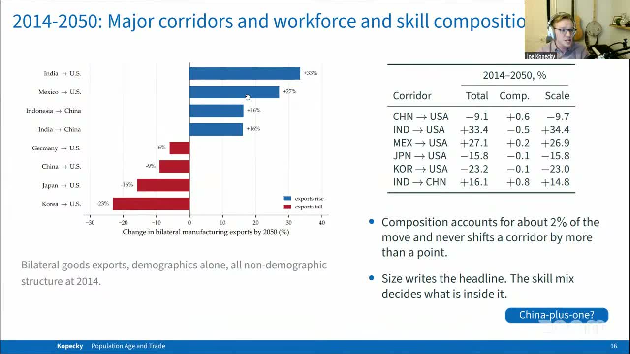
This led to the best clarifying question of the session, at 03:19:44. A participant (the captions don’t name them) asked whether scale is “basically just the data.” If you assume exports are proportional to working-age population and feed in the un projections (United Nations 2024), don’t you get the scale column? And if the age profiles were flat, wouldn’t composition go to zero and leave only that? Kopecky answered “more or less.” He has not actually run the flat-profile version (“I probably should report that somewhere,” 03:20:43). He thinks the geometric-mean split is “quite close to” doing so, “and that’s why I kind of say it’s a fancy accounting exercise in some way because I’m really just feeding those in” (03:21:11). The value added, he said, is underneath the flow.
That is a good answer, and I think it is the right way to read the paper. The volume results are gravity with a working-age-population term, solved in general equilibrium. They line up with the reduced-form gravity work of Brakman, Kohl and van Marrewijk (2025) and Kopecky’s own 2023 paper (pp. 12, 14) because they are nearly the same object. General equilibrium does contribute some detail. China’s own aging alone would cut its us exports by 13.4%, more than the corridor’s 9% fall, because the still-growing us workforce pushes back by 4.5% (p. 16). And the us market share China gives up does not go to India or Mexico. More than half is taken by domestic us production, and the rest spreads across suppliers roughly in proportion to their size (p. 17). This bears on the “China-plus-one” literature. The paper’s point is that some of the realignment people attribute to geopolitics is a demographic trend pushing in the same direction, and a study that leaves demography out will count it as a policy effect (p. 17).
The skill mix decides what is inside it
Now look inside a single corridor. Every sector in China’s exports to the us falls by 2050, but by very different amounts (Table 2, p. 15). Computers and electronics, 28.6% of the corridor with , is basically flat at −0.4%. Textiles and apparel, 15.0% of the corridor with , falls 16.8%. Basic metals falls 17.7%. The scale shock pulls everything down. The composition shock then partly offsets that for sectors that use older workers and adds to it for sectors that use younger ones. Kopecky: “electronics … that decline is going to be much less heavily felt … relative to textiles where … the skill effect is reinforcing the size effect” (03:22:55).
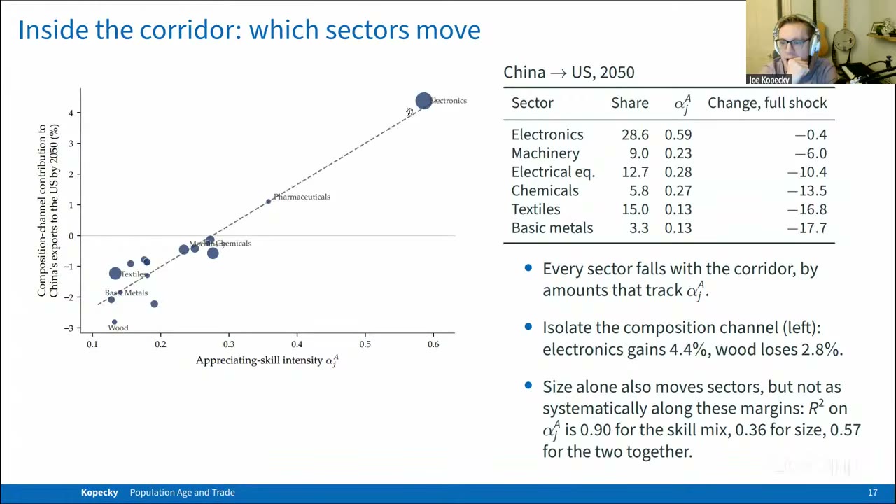
If you isolate the composition channel, the gradient is very clean. On the slide, electronics gains 4.4% and wood loses 2.8%. The Figure 2 caption gives the fit of the composition-channel contribution on as R² = 0.90 (p. 16). The slide adds that the same regression on the size channel gives 0.36, and on the full shock 0.57. There is an inconsistency in the draft here. The robustness section (p. 29) describes “the appreciating-skill gradient of Figure 2” as having R² = 0.58 at the baseline dispersion. That is almost certainly the full-shock fit (the slide’s 0.57) under the wrong label, not the Figure 2 fit. So 0.90 is the right number for the composition channel, and it should be quoted only with that qualifier.
So far this is Heckscher–Ohlin, which is well known. The less obvious part comes when you run the exercise over different periods. Figure 3 (p. 17) plots each country’s composition tilt, meaning the slope of its sector export changes on , against how much its workforce ages, for three 36-year windows. The correlation is at least 0.98 in every window. What makes this interesting is who moves along the line. On the slide (03:24:38), Japan’s tilt goes from +21 in 1950–86 to −13 in 2014–50, and China’s goes from −6 to +12. (The figure plots these values, but the text doesn’t state them.) Japan, among the oldest workforces anywhere, is now tilting toward the industries of the young. Japan didn’t get younger. Its own skill supply barely moves because its aging is mostly done. What happened is that everyone else started aging past it (p. 16). Kopecky: “this is a story of comparative advantage … your skill relative to your trading partners” (03:24:53).
So being old is not a comparative advantage. Getting old faster than your trading partners is, and it lasts only until they catch up. That is the idea behind the April title, and I think it is the paper’s real contribution. The corridor volumes are something you could have roughly guessed from gravity. Japan rotating toward physical-intensive sectors because the world is catching up with it is something you could not easily guess.
The paper also counts the workers involved. In Japan, 97% of the 9.7 million people employed in goods sectors work in industries whose exports fall by more than 10%. In Korea it is 91% of 3.7 million. Across the six fastest-aging economies it is about 24 million, and in China 35 million, nearly a fifth of goods employment (p. 18). Across countries, the export change facing the average goods worker runs from −20% in Korea to +46% in India (p. 17). The model reallocates all of these workers at zero cost, as the slide itself says (03:26:38), and the paper says it cannot price that adjustment (p. 18). The conclusion reaches for the China shock (Autor, Dorn and Hanson 2013) as the reminder of what such reallocation can cost (p. 31), which is the right reference and also the uncomfortable one.
Welfare: two prices that nearly cancel
The total welfare numbers are huge and mostly beside the point. With technology and capital held fixed, real income by 2050 falls 34% in Japan, 40% in Korea and 32% in China, and rises 52% in India and 35% in Mexico (p. 24). Nearly all of that is fewer workers producing less, which a closed economy would feel just as much. The composition shift accounts for −0.03% of Japan’s −34%. The paper treats these totals as labour-supply benchmarks, not forecasts.
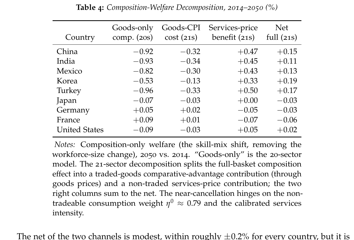
The composition channel’s welfare effect is where the paper gets clever. For a fast-aging economy it splits into two opposing forces (Table 4, p. 25). World aging makes the traded goods China buys more expensive, which costs China 0.32%. But the services China produces are appreciating-intensive (), and they get cheaper as that skill becomes abundant, which is worth +0.47%. The net is +0.15%. So in this model China, one of the fastest-aging economies in the sample, comes out slightly ahead on the skill mix. Korea nets +0.19% and India +0.11%, while Germany, Japan and France net small losses. Kopecky described it in the talk as goods getting “relatively more expensive” while services, “from a demographic kind of trade perspective,” get cheaper (03:30:38). The slide adds that the net is positive for 23 of 29 economies, which the paper doesn’t state.
The paper is candid about how much this depends on. The cancellation relies on services taking a 0.79 average consumption weight and on a services skill intensity that is “calibrated, not validated” (p. 26). Without the services sector, China’s figure is −0.92 (p. 25). The sign flips if employment weights are dropped or the intensity dispersion is compressed (p. 29), though no variant produces an effect above 0.6% in magnitude. “I therefore do not lean on any single net welfare number” (p. 26) is the correct sentence, and it is in the paper.
Two more parts can be dealt with quickly. A minimal saving block, which reweights fixed us age profiles of wealth and income, makes aging economies creditors and young ones debtors. It leaves the corridors almost where they were (correlation 0.994 with balanced trade, p. 20). Its 35% fall in the world interest rate scales with interest elasticities the paper calls placeholders (p. 21), so it should not be read as an estimate. The robustness checks keep the corridor ranking across 870 corridors (correlation at least 0.97). The largest movements come from zero migration, which takes China to the us from −9% to −16% and Japan to the us from −16% to −25% because the us workforce stops growing (p. 30), and from making services 10% tradeable, which shifts magnitudes by 10 to 20 points (p. 29).
What the room pushed on
There was no discussant, and the captions name none of the questioners, but the questions converged on one point. At 03:27:03 someone asked whether Chinese or Korean productivity catch-up enters. It doesn’t: adding it would “muddy the main story.” The follow-up (03:28:22) asked whether the backcast reproduces historical sector shares. Kopecky said he could say “with some confidence that there would be a lot unexplained by the model” (03:29:18) and agreed to run the comparison. In the open Q&A, one participant noted that quantities in these models are mostly driven by scale, so the action should be in relative skill prices, and asked about inequality (03:32:44). Kopecky moved to his preferred extension, an age-varying demand side, and acknowledged “that’s not even close to an answer to your question” (03:34:18). Asked why he reports exports rather than imports (03:34:42), he said the two are symmetric under balanced trade and exports fit a model built around the supply side.
The last question (03:37:51) was the sharpest. Do the model’s sector tilts predict actual changes in export composition in the raw data? Kopecky said the appendix matches well, but “kind of by construction” (03:38:45), because the skill tilt is calibrated to Cai and Stoyanov’s regressions. The check that would actually test it is to correlate his simulated flows with the demographic component of gravity equations estimated on data, and he said “I should just do that, I suppose” (03:39:42).
That test matters. The volume result doesn’t need it, since, as the first clarifying question established and Kopecky agreed, that part is close to the data being fed in. The composition result is the one the paper exists for, and so far its main evidence is that it matches the regressions it was calibrated to reproduce. It may well hold up: the mechanism is clean, the ranking of sectors is robust, and Japan losing its advantage to China as China ages past it is a genuinely good story. But for now it is a well-calibrated story waiting for an out-of-sample test.