Notes on:
Expanding the Frontier of Economic Measurement: Weekly Regional Employment Statistics
NBER EMRI conference paper
17 September 2026
employment measurement · regional economics · payroll data · high-frequency data
Talk · Paper · Slides · PDF · Transcript
Made with AI: Opus 5 (reading, diagram and writing), GPT 5.6-Sol (reading), Fable 5.1 (adjudication), Sonnet 5 (verification)
Part of Innovations in Measuring Employment, Fall 2026
American employment is published on two grids, and a local shock can hide in the space between them. The Current Employment Statistics survey is monthly, reasonably fast, and stops at states and metro areas. The Quarterly Census of Employment and Wages is a near-universe count of everything covered by unemployment insurance, reaches the county, and arrives several months after the quarter it describes. So the first sentence of this paper is a claim about resolution rather than about accuracy: “Economic shocks do not wait for statistical release calendars.” Kyle Hood, presenting for a team spread across bea, Census, bls, Toronto and Opportunity Insights, said the live version — “economic shocks, they don’t really wait for statistical releases” — and picked the obvious examples: a hurricane, a major employer contracting between one month and the next, a vacation town whose season peaks in a single week in August. Each of those lives inside a cell that neither grid can resolve.
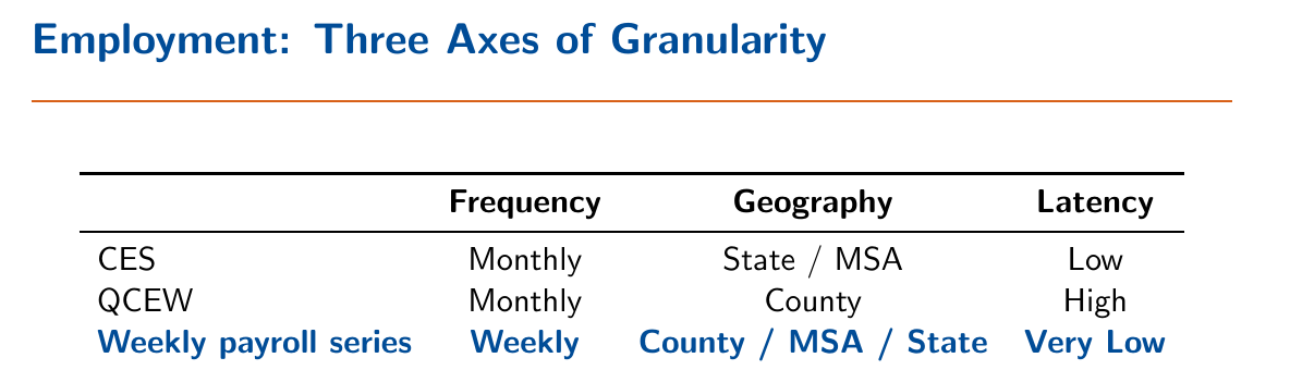
The thing being offered is a third point on that frontier. It is a September 2026 conference draft — Hood called the series “hot off the press” and opened by pre-empting the charge of over-claiming in his own title — and the series itself went public during the conference. He got the email at 12:07 that afternoon saying the indexes had gone live on the Opportunity Insights tracker, and spent his last five minutes demonstrating them from the podium, clicking into Montgomery County, Maryland, and wondering aloud what had happened to professional and business services there in late 2024. The underlying data are employee-level payroll records from one large processor covering more than 5 percent of us private-sector employment, tilted toward small and medium firms rather than the large multi-establishment employers that dominate adp-style samples. The draft declines to name the processor; the presenter noted the publication website “tells you who it is,” and when the chair asked directly, he read the answer off the live site. It is Paychex.
The gate, and what it throws away
You are a payroll processor’s client list, not a sampling frame. Employers arrive and leave for reasons that have nothing to do with hiring — a merger, a better quote from a competitor, a slow migration that moves half the staff this week and half the next. Raw totals would therefore mix employment growth with the processor’s market share, which is why nobody should read a vendor’s headcount as a macro series and why this paper spends its methodological section not on the numerator but on membership.
The fix is the matched-sample logic ces already uses, tightened. An employer is a continuing unit in week only if it shows positive employment in , in , and in . The current-and-prior requirement makes each growth link same-employer; the four-week lookback is there specifically to catch the employer drifting between providers, which would otherwise register as spectacular growth in the week the second half of the payroll shows up. Hood’s gloss on the lag length was refreshingly unadorned: “we decided on this based on some various testing.” Everything that fails the test is classified — employers present last week and gone this week are exits, other observed employers are entries — and then discarded, because the data genuinely cannot tell a birth from a new customer or a death from a defection. Live: “we will not capture firm births and deaths in this series at all.”
What survives is a size-weighted growth factor, chained:
Here is employment at employer in geography in reference week — a Saturday-ending week, the deliberate analogue of the ces pay period containing the 12th — is the set of continuing employers, and is the published index, normalised to the week ending 7 January 2023 and reported as net growth from that base. Employment is summed before the ratio is taken, so big employers count for more. The whole epistemology sits in the subscript: everything the index can and cannot see is a fact about membership of , and levels are never spliced across data extracts, so the matched set may churn from week to week without the churn entering as growth. The series are then seasonally adjusted with a robust stl at a 52-week period, plus a rolling-median patch over the winter holidays, where payroll timing and year-end client churn make a hash of anything weekly.
The authors are clear-eyed about the price. The index is a growth concept inside an evolving matched sample, “not representative of employment levels,” and “not a substitute for qcew.” And because net firm entry is normally positive in an economy that is not on fire, an index that discards entry is biased down in ordinary times. Note also what is not happening here: the comparisons against ces and qcew are validation, not calibration. The weekly index is never benchmarked to or blended with the official series in this paper. It is asked to stand on its own and then graded.
Buncombe County
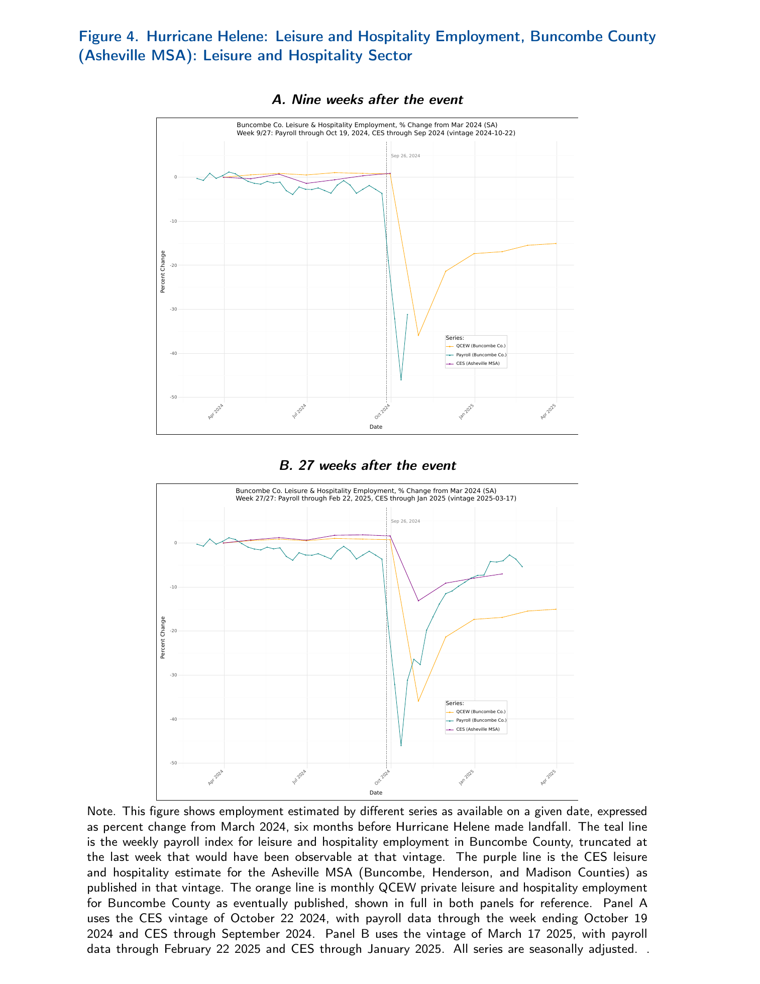
Helene made landfall in Florida’s Big Bend on 26 September 2024, but the catastrophic damage was inland rainfall flooding in western North Carolina. Take the vintage of 22 October 2024 — payroll data through 19 October, ces through September — and ask what an analyst could have known. The weekly payroll index for leisure and hospitality in Buncombe County had fallen approximately 42 percentage points within two weeks of the storm, from a pre-storm level near −3 percent to a trough around −46 percent against March 2024, and had begun to turn back up. The ces estimate for the Asheville msa showed essentially no movement. There was no qcew observation for 2024 Q3 or Q4 at all. The paper’s claim for that panel is narrow and, as far as I can see, correct: it is “the only source that identifies both the magnitude of the disruption and the beginning of the recovery.”
ces was late, but it was also aimed at the wrong target. It publishes the Asheville msa, which is Buncombe plus Henderson plus Madison, and the other two counties were far less affected — so even after the timing problem resolves, the geography problem dilutes. Pinellas County in the Tampa msa, hit by the same storm as surge rather than as infrastructure loss, contracted roughly 20 percent against Buncombe’s roughly 40, and suffered the same dilution against a metro area that also contains Hernando, Hillsborough and Pasco. That contrast is the strongest thing in the paper. A weekly county series distinguished two hydrologically different events in the same storm, in something close to real time, and neither official source could have.
And then it heals too well
Now look at Panel B, the same county five months later. The payroll index has recovered to roughly −4 to −5 percent, ces for the metro area sits near −7, and qcew — the thing that eventually gets it right — settles near −15. The index that was uniquely right on impact is the most optimistic series on the chart at the point where a policymaker would actually want to know whether Asheville came back.
The mechanism is the gate. A firm that never reopens does not report zero; it stops reporting, fails the continuing-unit test, and exits — so it stops subtracting rather than continuing to subtract. qcew, being a census, books the net change. The paper says this about itself, twice, and draws the right conclusion: the weekly series is “better suited to identifying the onset and initial trajectory of a disruption than to measuring the extent of eventual recovery.” It is worth being precise about what kind of error this is. It is not generic big-data noise. It is a directional artifact of the estimator’s identifying filter, and it runs down in steady state and up after a shock, which means the one design choice that makes the series possible is also the one that makes it flatter you exactly when flattery is most expensive. From the podium this got softer treatment: Hood voiced it obliquely for Pinellas, where the payroll line shows “maybe a more similar type incomplete recovery,” and did not voice it for Buncombe.
The accuracy table, which the authors printed and did not hide
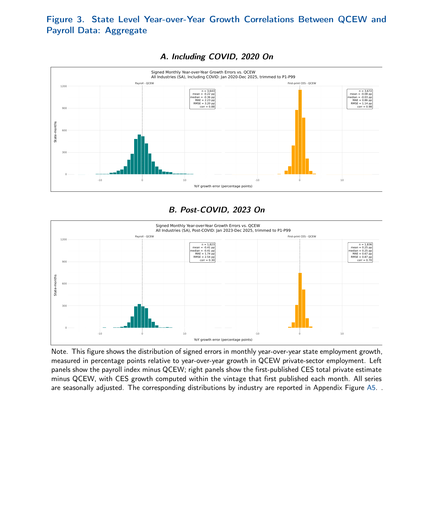
This is the like-for-like comparison, and it is like-for-like: monthly year-over-year growth at the state level, computed from the payroll series as first published and from ces within the vintage that first published each month, each measured against year-over-year growth in the final qcew private-sector estimate, same windows, same units, near-identical counts. Including Covid, from January 2020, the payroll index has a mean absolute error of 2.23 percentage points against first-print ces’s 0.86, with pooled correlations of 0.88 and 0.98. Post-Covid, from January 2023, payroll runs 1.74 pp against 0.67, and the pooled correlations are 0.30 against 0.70. ces is about 2.6 times more accurate by mae in both windows, and the payroll errors sit left of zero — mean −0.22 pp and −0.41 pp — which is what an index missing net entry ought to look like, though composition differences are in that number too.
Two caveats in opposite directions. The correlations in this exhibit are pooled across state-months and are a different object from the per-state time-series correlations elsewhere in the paper, so the 0.30 and the frequently quoted median-state figures are not the same statistic and should not be run together. And the payroll side is, if anything, treated generously: the series analysed is a periodic full-history rebuild in which all but the most recent weeks are final, so real-time payroll vintages could only widen the gap. Hood said all of this out loud in his summary — the payroll series are “not really uniformly more accurate than the existing ces,” “the first published ces estimates are generally closer to the final qcew,” the comparative advantage is “timing and sort of the geographic resolution,” and “we still need the official statistics like qcew and ces for representativeness and validation.” An agency built a county-level weekly employment product, shipped it on a public tracker that morning, and used its conference slot to explain that it loses to the survey everyone already has on every dimension except the two where no competitor exists.
The discussant found the same fault, from the outside
Jason Faberman of the Chicago Fed had ten minutes for all three Session 2 papers, and was supportive in principle and sceptical in practice: “I think it’s a great exercise, I think it’s a very useful exercise, but for me at least when you dig a bit deeper into the data I’m wondering whether it’s up to the task of these weekly regional estimates that the authors are after.” He pushed three times. The national match looks similar but differs “on the order of several percentage points in terms of the level of employment over certain periods.” Then he went to the paper for a figure the talk had skipped: “Kyle didn’t show the numbers, but in the paper they also look at these correlations over time across states… the correlations aren’t that strong across a large swath of states and even some states negative.” He is right that it was skipped, and right about the contents — post-Covid, the per-state correlations for leisure and hospitality have a median of 0.67 and a handful of negatives, Alabama at −0.04 — and the paper’s partial defence, that stripping the pandemic mechanically shrinks common variation relative to idiosyncratic noise on both sides, is fair but does not make the map go away.
The third push is the one worth keeping. “The payroll survey estimates compared to the qcew… show a much bigger drop on impact, but they also show a much stronger recovery. My read of that is that’s probably because we’re missing all of the exits that may have happened during that period by focusing on the continuing establishment.” That is the paper’s own diagnosis, reconstructed from the charts by someone who had not been told it, which is about the strongest evidence available that the diagnosis is right. And he named a fix rather than just a flaw: “unless there’s a way to, for example, apply the methodology from the first paper to the payroll survey data, we may be limited in what we can say even at a local level” — meaning bolt Kurmann and Lalé’s openings-and-closings identification, presented an hour earlier in the same session, onto the payroll panel to recover the extensive margin.
Nobody answered. The chair opened a shared floor for all three papers, and the fifteen minutes went entirely to the uk administrative-data paper and to American data infrastructure — Matthew Shapiro proposing that the British replace their survey outright, John Haltiwanger observing that the us equivalent of the uk’s real-time tax records already exists and “it’s called the Internal Revenue Service,” a Census researcher pointing out that the National Directory of New Hires sees every hire the moment an I-9 is filed and needs an act of Congress to reach the statistical agencies. The only question put to this paper’s presenter all session was the chair’s, immediately after the talk, asking who the payroll provider was. So the estimator critique was not rebutted in the room; it was not contested in the room either.
Which leaves the series roughly where its own discussion section puts it: “No single source dominates along every dimension.” The honest way to hold it is that the weekly index is a magnifying glass, Hood’s word, and a magnifying glass is a device with a very short depth of field. It resolves the week the water came through Asheville, at a geography no official series publishes, faster than anything else in existence. Then the firms that never reopened quietly stop being in the sample, and it tells you the town is nearly fine.