Notes on:
Import competition and U.S. sentiment toward China
Journal of International Money and Finance
9 April 2026
import competition · China shock · sentiment · geoeconomic fragmentation
Paper · doi · PDF
Made with AI: Haiku 4.5 (research), Opus 5.5 (reading and writing), GPT 6-Sol (reading), Fable 5.1 (adjudication), GPT 6-Astra (verification)
Rabah Arezki, Duong Le, Ha Nguyen and Hieu Nguyen, Journal of International Money and Finance 164 (2026), 103540 (earlier CESifo Working Paper 11044, 2024). pdf-only digest of the published version; no talk or discussant.
“Import competition and U.S. sentiment toward China” takes the Autor–Dorn–Hanson China shock, which we already know cost exposed commuting zones jobs, wages, tax revenue and some of their health, and asks what it did to how those places talk about China. The answer, measured through the tone of local newspapers, is that places hit harder by Chinese imports saw their China coverage sour more over 2000–2014, and that the souring spills out of the business pages into coverage of China’s military. The design is the familiar one. The new part is the left-hand side, and most of what is interesting about the paper, and most of what a careful reader will want to poke at, lives there.
The mood line
Start with the national picture, because it is a nice chart. The authors pull every article that Dow Jones factiva classifies as discussing China from the top 137 U.S. publishers by circulation, 420,642 articles from 1979 to June 2020, and score each one by counting words:
Eq. (1) is net tone per article, bounded in with zero neutral, where “positive” and “negative” come from the general-purpose lexicon of the Python package polyglot. Articles are then averaged by place, topic and year.
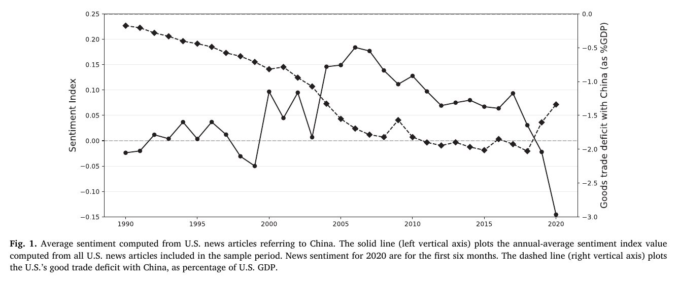
Fig. 1 has three acts. The 1990s hover around zero. After wto accession the tone turns positive and climbs to a plateau in 2004–2007, while the goods deficit with China widens steadily toward 2% of gdp, so for a decade the deficit and the tone moved in opposite directions. Then a slow slide, and from 2017, with the trade war, a cliff: negative in 2019 “for the first time since the late 1990s,” and the lowest value in the sample in the first half of 2020. The paper says sentiment “peaked in 2007”; on the chart 2006 sits a hair above 2007, so read “peak” as “the top of a 2004–2007 plateau.” (The text also describes a Tiananmen dip in 1989 that the chart, which starts in 1990, does not show.)
Making newspapers local
To get from a national mood line to a cross-section you need places. The authors drop the national outlets (abc, cbs, cnn, Fox, msnbc, nbc, the New York Times and the Wall Street Journal are the ones named), which leaves 338,894 articles from 156 local sources located at their headquarters. Then each commuting zone gets every source within 300 miles of its centre, weighted by inverse distance. The 300 miles are, in the authors’ words, “an arbitrary cutoff to approximate feasible distance for daily distribution of articles’ physical prints”: the radius of a delivery truck. That covers 560 of the 722 mainland commuting zones.
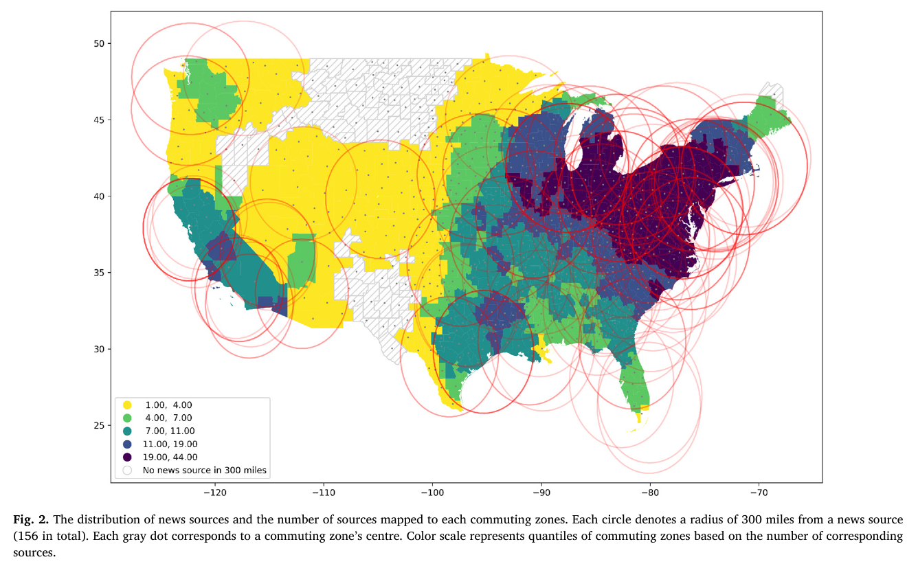
Fig. 2 is worth looking at for what it implies. A 300-mile circle is big, so neighbouring commuting zones largely share the same papers, and the index for a small manufacturing town in Ohio is a distance-weighted blend of whatever the Great Lakes metro dailies printed. The “local sentiment” of a commuting zone is really the sentiment of its regional newspaper market, which is a fine thing to measure as long as you remember that is what it is.
The regression
Now the adh machinery. A commuting zone’s exposure is its 1990 industry employment mix times the 2000–2014 rise in U.S. imports from China in each industry, scaled by 1991 U.S. absorption; the median commuting zone’s value is 0.998. Because U.S. imports could respond to U.S. demand shocks that also move local moods, exposure is instrumented with the same construction built from Chinese imports into other high-income countries, on 1980 shares:
In Eq. (5), is the 2000–2014 change in sentiment in commuting zone for factiva topic group , are the 2000 occupational, racial and demographic controls from Autor et al. (2019), are topic-group dummies and errors are clustered by state. Eq. (6) is the instrument, other rich countries’ industry-level import growth from China weighted by 1980 employment shares . The unit of observation is commuting zone by topic, six topics (economic, commodity and financial markets, industry, politics and social, general and routine, other), and the cells are unbalanced: 2,521 observations rather than .
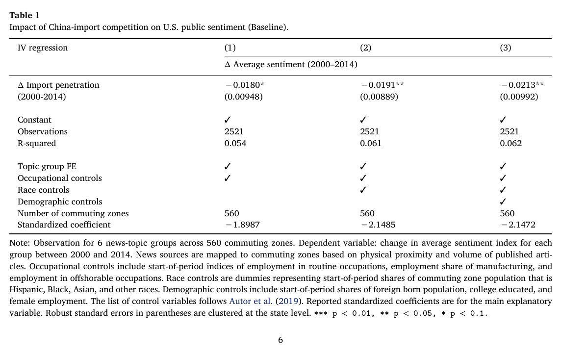
Table 1 gives of −0.0180, −0.0191 and −0.0213 as controls are added, significant at 10%, 5% and 5%. Since the median commuting zone got about one unit of exposure, the median dose of Chinese import competition is worth roughly two hundredths of a sentiment point relative to an unexposed place, against a national swing of about 0.35 (from −0.15 to 0.20) over the whole sample, so about 6% of it. That is modest but not nothing, given how crude one side of the regression is. One small thing a reader will notice: the text describes the estimates as “over 0.03 unit decline,” which is not what the table says; 0.03 is closer to the 1990–2000 extension (−0.031 to −0.033). The table is the thing to believe. (Also worth knowing before you read the appendix: the row labelled “standardized coefficient” is, to four decimals, coefficient divided by standard error, so it is a t-ratio.)
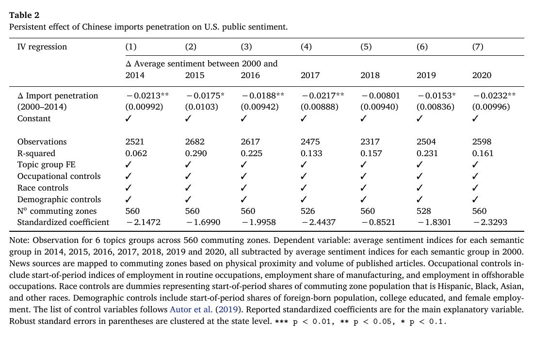
The effect hangs around. Holding exposure at 2000–2014 and extending the outcome to sentiment in each later year minus 2000, the coefficient is −0.0217 in 2017 and −0.0232 in 2020, with 2018 the one year that loses significance:
The robustness appendix does what you would want it to do: future exposure does not predict 1990s sentiment changes (the placebo is small, positive and insignificant), the estimate grows as the radius shrinks to 200 and 100 miles, and machine-learned topic clusters built from article titles give similar numbers at 6 and 8 clusters (the 10-cluster version is insignificant).
The surprising part
Here is the thing that makes the paper more than an adh replication with a new outcome. Split by theme, and then split the political and social theme into sub-topics:
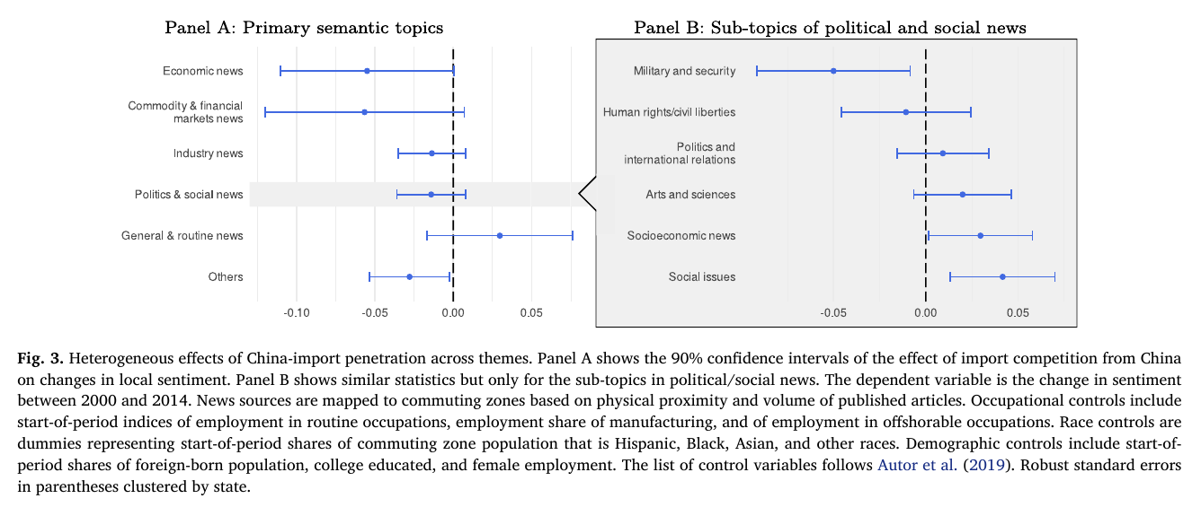
In Panel A the largest effects are where you would expect, economic news and commodity and financial-market news, both around −0.055 to −0.057 read off the plot, though at 90% their intervals touch or just cross zero. Panel B is where it gets strange. “Military and security” coverage of China sours by about −0.05, with an interval that clearly excludes zero, about as much as economic news. The exposure measure is built entirely out of traded goods; the industries carrying half the instrument’s weight, per the Rotemberg decomposition, are radio and tv equipment, furniture, women’s footwear and underwear. Somehow the places that lost the furniture factories write, or read, more darkly about the People’s Liberation Army. That is the paper’s geopolitical claim in one estimate, and it is a genuinely interesting one: resentment formed in the labour market turns up in the security pages.
The mirror image, which the paper does not dwell on, is that “Social issues” (around +0.04) and “Socioeconomic news” (around +0.03) go the other way. Because the outcome is a change, that means exposed places saw a more positive change in tone on Chinese society than less exposed ones, which could just as well be a smaller fall as an actual rise. Either way it complicates the abstract’s claim that the effect is “broad-based, encompassing political, military, and national security issues.” Within politics, military coverage is clearly negative, “Politics and international relations” is near zero, and the social sub-topics move the other way. “Military, and then not much else in politics” is the more accurate summary, and it is still a striking one.
What a critical reader would press on
No discussant was available for this paper, so this passage is ours, drawn from the verified brief. The big question is what the outcome measures. It is the tone of newspapers, not of residents, and the design cannot separate readers’ views from editorial choices or from wire and press-release copy (Business Wire is the second-largest publisher in the full corpus, though the paper does not report how much such content survives into the local sample). The lexicon is general-purpose, and the biggest effects are in exactly the financial and commodity news where words like “fall,” “decline” and “loss” may track market moves in exposed industries rather than attitudes toward China. The Rotemberg decomposition adds to the doubt: for economic news, the biggest positive contribution comes from radio and tv equipment, which fits “coverage follows the local industry” at least as well as it fits “resentment.” There is also no first stage or F-statistic reported, no labour-market mediator, and the 300-mile assignment means many commuting zones share most of their sources. None of this undoes the result, but it moves it from “sentiment” toward “local press coverage,” which is a narrower claim and probably the one the data can carry.
So the careful reading is this: the China shock made the regional newspapers of exposed America more negative about China, persistently, and not only on the business pages. Whether those papers were reporting their readers’ mood or helping to form it, the gap between exposed and unexposed places was already there in 2014, a few years before the national line in Fig. 1 went off its cliff.